
A LOGO WITH A STORY
Making Of
A LOGO WITH A STORY
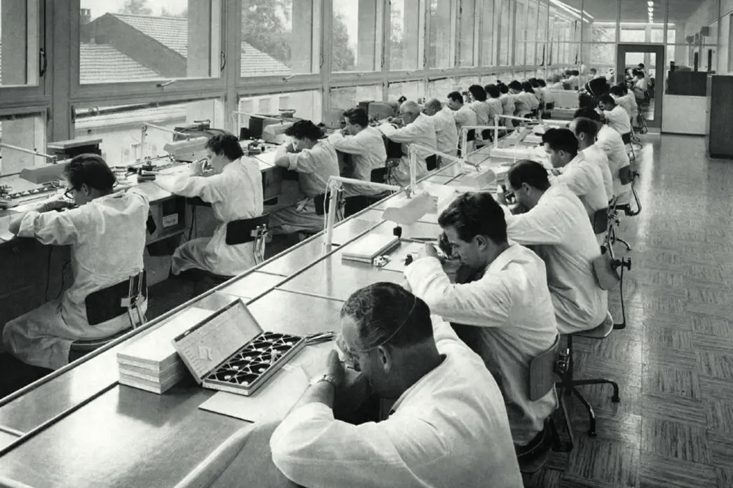
Heritage shaped for today
A logo is more than just a brand’s signature. It’s a statement, a promise, a story in miniature. For Universal Genève, the redesign of its logo wasn’t about recreating the past — it was about distilling over a century of heritage into a mark that feels fresh but familiar. The result? An emblem with a past, a future, and a very polished “U.”
Our story begins in Le Locle, Switzerland — a modest start for a brand with universal ambitions. Twenty-five years later, Universal Genève packed its bags for Geneva, the heart of the Swiss watch industry. To mark the move, the founders borrowed Geneva’s iconic shield — a timeless emblem, but with a twist.
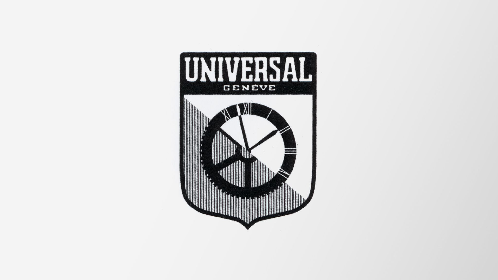
Nestled within the shield’s silhouette, they saw something unexpected: the shape of a U. Elegant, understated, and, as it turns out, distinctly Universal.

The U took center stage in the decades that followed. By the 1960s, it was paired with the full company name, a touch of grandeur to match the era. Even in the 1970s, when bell-bottoms and bold design choices took over the world, the logo adapted.
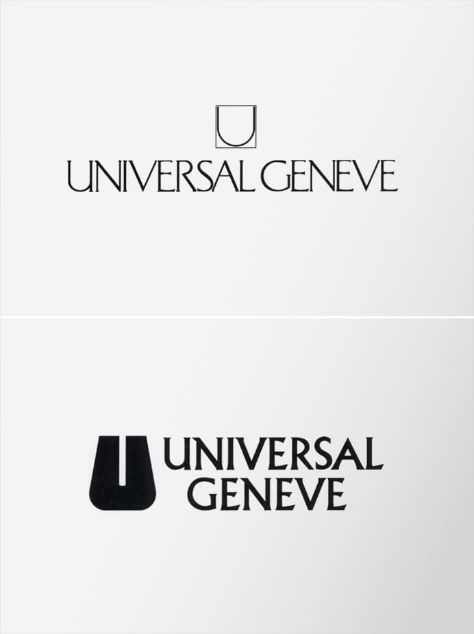
Then came a paring back, with the logo evolving into a simple, clean, curved-line U. Quietly confident, effortlessly modern.

Today, the Universal Genève signature has been reimagined once more, combining the best of its history — the pointed U, the proud full name, and the signature curved lines. It’s a balance of precision and personality, a logo that nods to the past while standing ready for the future.
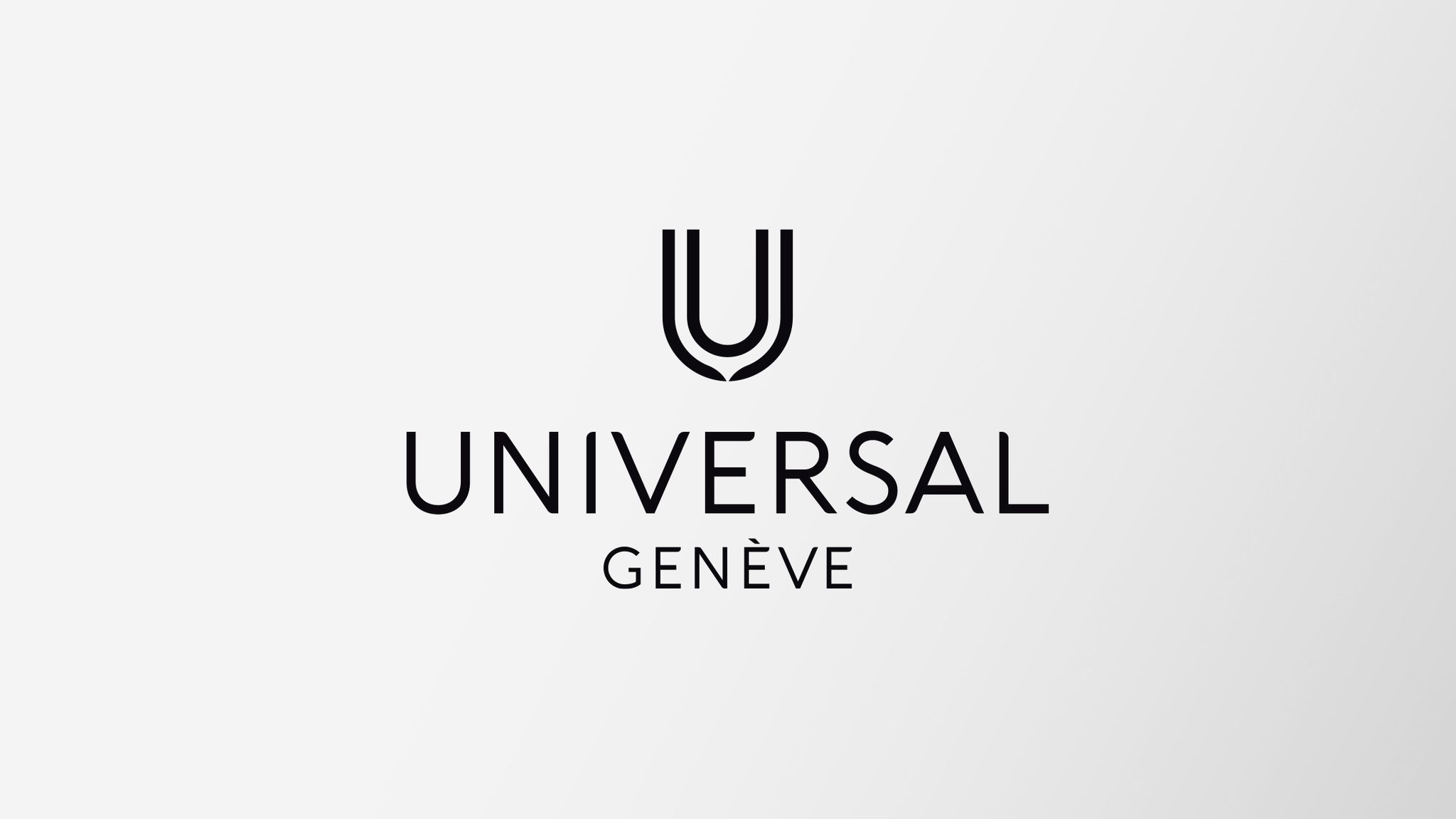
The new Universal Genève logo is more than an update. It’s a conversation between eras, a celebration of ingenuity and refinement. Sophisticated yet playful, it reflects the essence of the brand slogan, “Le Couturier de la Montre.” A reminder that while styles evolve, true elegance endures.
NESTLED WITHIN THE SHIELD’S SILHOUETTE, THEY SAW SOMETHING UNEXPECTED: THE SHAPE OF A U. ELEGANT, UNDERSTATED, AND, AS IT TURNS OUT, DISTINCTLY UNIVERSAL.